

Building the Home for “Hummingway”

Owner of MP James (left), Brittany and actress (right), Ashley photographed in Ashley’s new office space!
Actress and Entrepreneur, Ashley Greene’s “Hummingway” office space was an exciting and innovative collaboration from initial concept to installation. It was inspired by earthy neutrals and fabulous textures.
When we first met with Ashley, we could instantly feel her relaxed positive energy and undeniable passion for her new company, “Hummingway.” As she spoke about her business ventures, we knew that her company was destined for a bright future and she needed an office space that reciprocated that energy.
We wanted this to be a space that Ashley could spearhead her business into success without feeling overwhelmed by overpowering color or eclectic finishes.
We designed her space to feel grounded, inspiring, and imaginative. We began by creating a few mood boards and renderings to get a feel of Ashley’s style. We quickly noticed her gravitating to femine neutrals, earthy textures, and a few understated-glam pieces.


We also chose to personify Ashley’s laid back feminine style by creating a space for her to showcase her high end handbags in a simple, yet effective way.


We created a sense of visual interest and depth, by painting the fireplace a soft taupe color and adding an oversized, circular shell mirror above the mantle to make the space feel larger.
Opposite the fireplace we added a stunning textured vinyl Crocodile print Phillip Jeffries wallpaper. The wallpaper acts as a floor to ceiling art piece, subtle enough to leave you wanting more, and nods at the custom snakeskin upholstery of the Bernhardt hammered steel lounge chair.
Hints of glam were introduced through brass accents in the desk chair, shelving, and linear chandelier. To keep the design from feeling too uniform, we balanced those finishes with a burnt brass side table and a hammered steel accent chair. Much like a well-curated outfit, the goal was to thoughtfully mix metals, creating a space that feels effortless, sophisticated, and beautifully layered.

The final phase was dressing the space. We sourced from a variety of local shops including our own to find pieces of varying scale and texture. We wanted to make sure we would have enough items to fill the space properly while continuing to tell the same story that we did with designing the space. This phase involves a lot of mixing and matching, layering, delayering, rearranging, and rearranging again.
It’s important to get it just right in terms of color story, size, placement, etc. We chose to dress the shelves with books, crystals, Ashley’s beautiful handbag collection, unique art pieces and of course–the inspiration, the “Hummingway” packaging.

We dressed down the show stopping snakeskin leather chair with a cozy throw blanket and upholstered pillow. The desk was topped with a warm camel leather desk organizer, marble bookends that mirror the top of the accent table, and leather bound notebooks.


We had the pleasure of designing this space from start to finish and couldn't be more excited to see Ashley bring her vision to life. We can't wait to watch her business continue to grow in a space designed just for her.
All photos done by: Charlotte Lea Photography
Achieving the Look - Modern Farmhouse
Modern farmhouse continues to be one of the most requested design styles we see and for good reason. While we love the warmth and character it brings to a home, we always encourage our clients to think beyond the trend and create a space that will still feel beautiful years from now.
The key to achieving a timeless modern farmhouse is balance. We recommend blending modern finishes with subtle farmhouse elements instead of leaning too heavily into rustic details. This creates a home that feels warm, inviting, and current without looking overly themed.
Like all areas of design, there aren't strict rules. Some of the best spaces intentionally break them. The important thing is that every design choice feels purposeful and contributes to the overall vision of the home.
Here are a few of our favorite ways to achieve a modern farmhouse look that feels timeless rather than trendy:
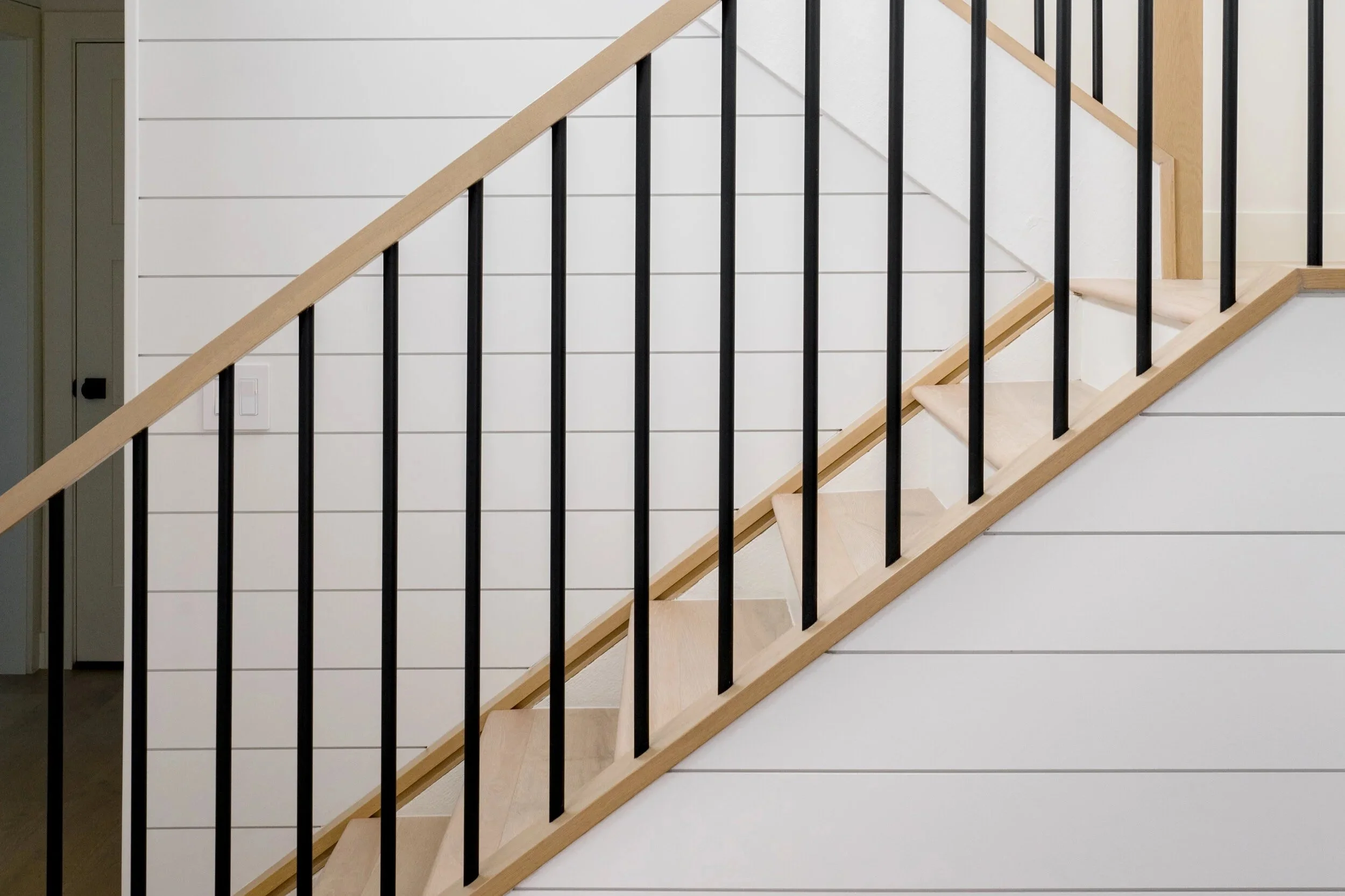
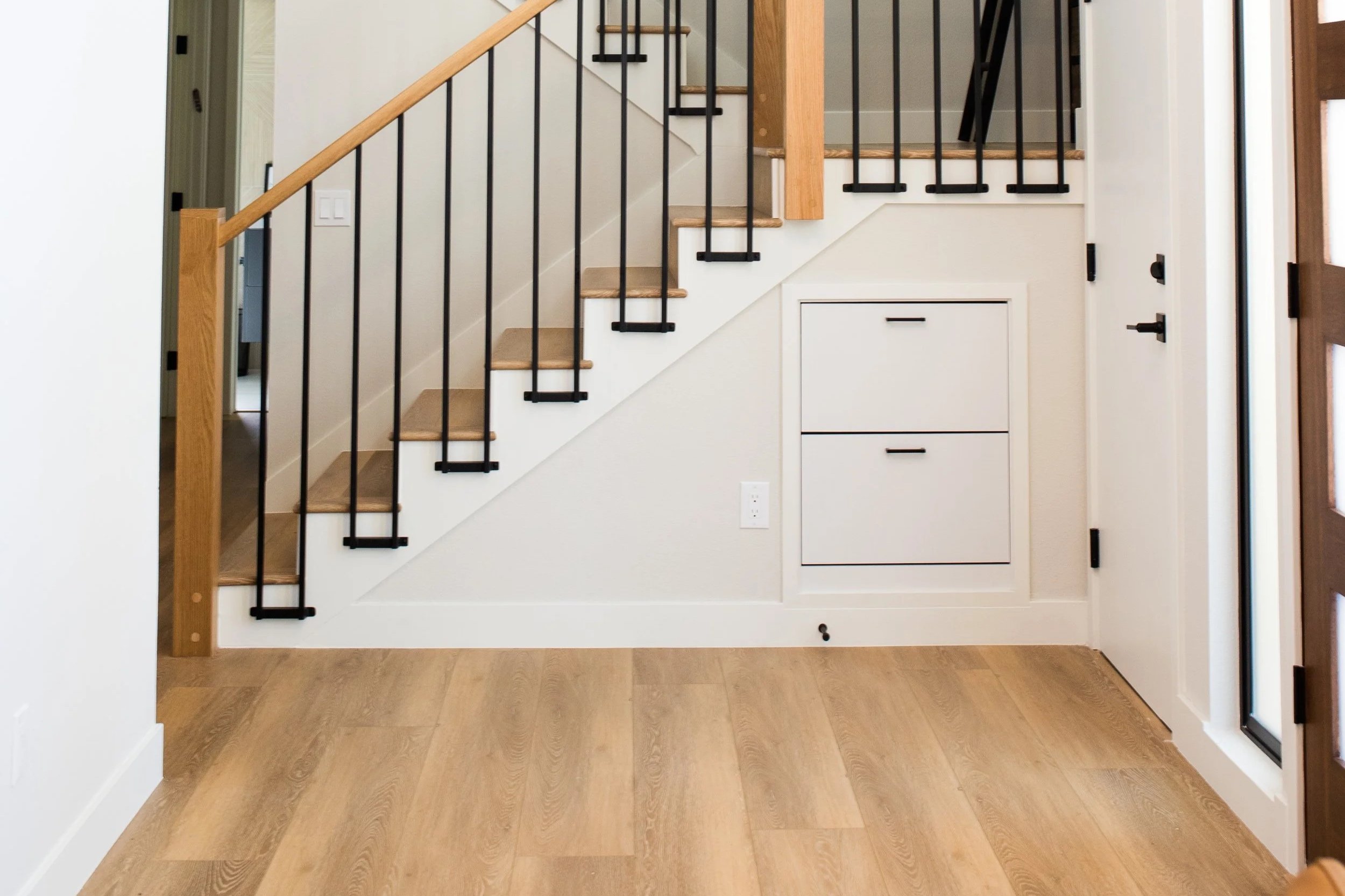
Shiplap
Board and Batten
Industrial Lighting
Neutral Color Palette
Simple Mitered-Edge Baseboards
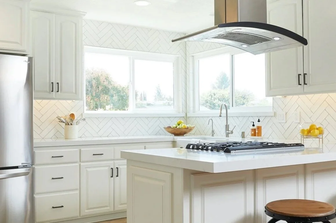
Custom Subway Tile
Simple Cabinetry
Shiplap is one of the signature elements of modern farmhouse design, but more isn't always better. Instead of using it throughout the home, choose a few areas where it can create a focal point and add architectural interest.
Some of our favorite places to use shiplap include:
Fireplace walls
Stairwells
Powder bathrooms (especially in an accent color)
One bedroom accent wall in a warm neutral or charcoal gray
Using shiplap strategically can help create a custom, timeless look without overwhelming the space.
With Board and Batten Less is often more. Rather than using it throughout the home, choose one or two areas where it can serve as a focal point, such as a fireplace wall or large accent wall. Taking the time to plan the spacing and proportions beforehand will ensure a custom look that feels balanced and intentional.

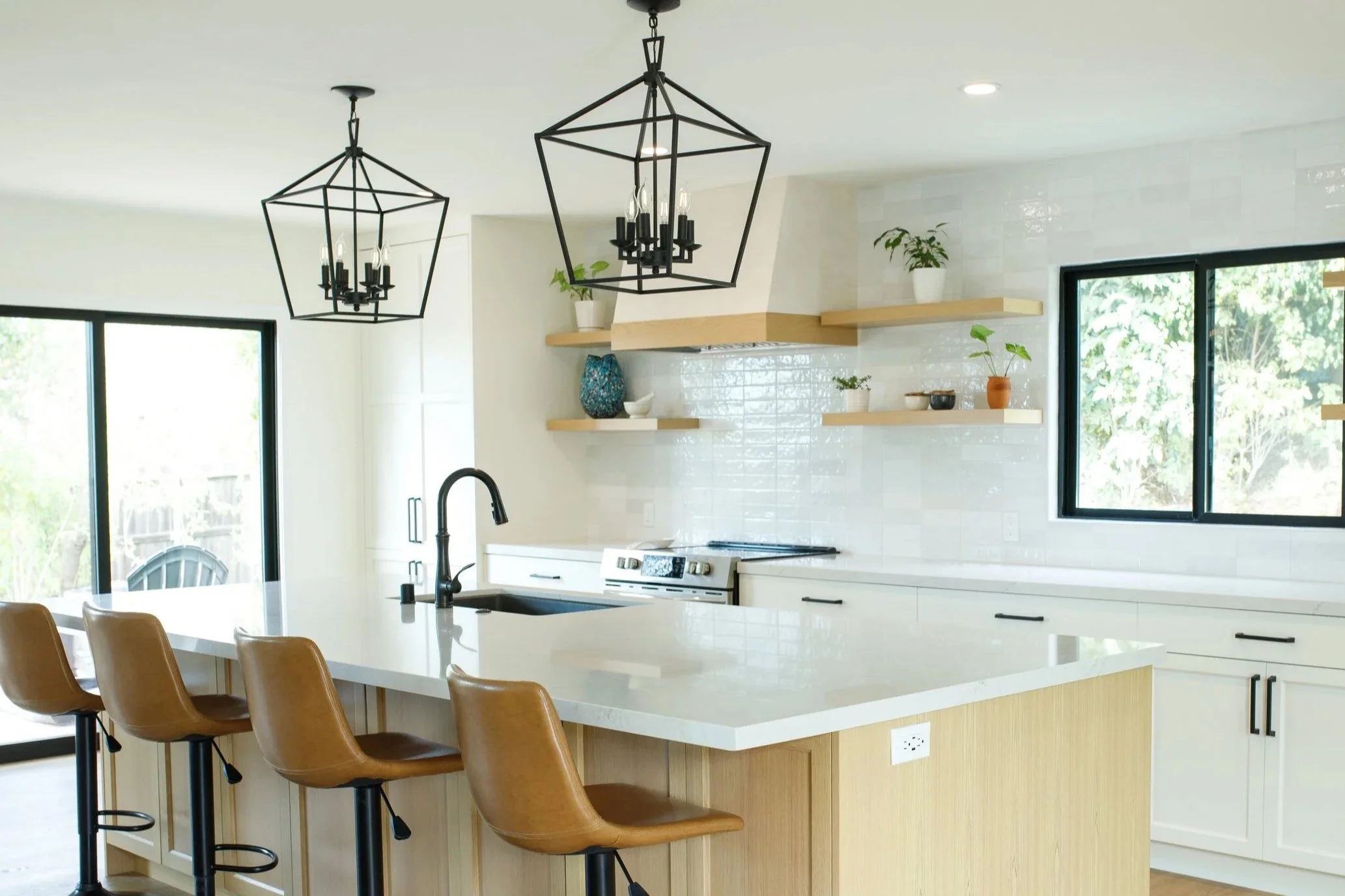
Industrial-inspired lighting is a staple of modern farmhouse design. We especially love matte black fixtures for the contrast and character they bring to a space. Whether you're selecting pendants, sconces, or chandeliers, pair them with warm 2700K–3000K bulbs to create a cozy, inviting atmosphere. Cooler white bulbs can make a space feel sterile and wash out the warmth of your finishes.
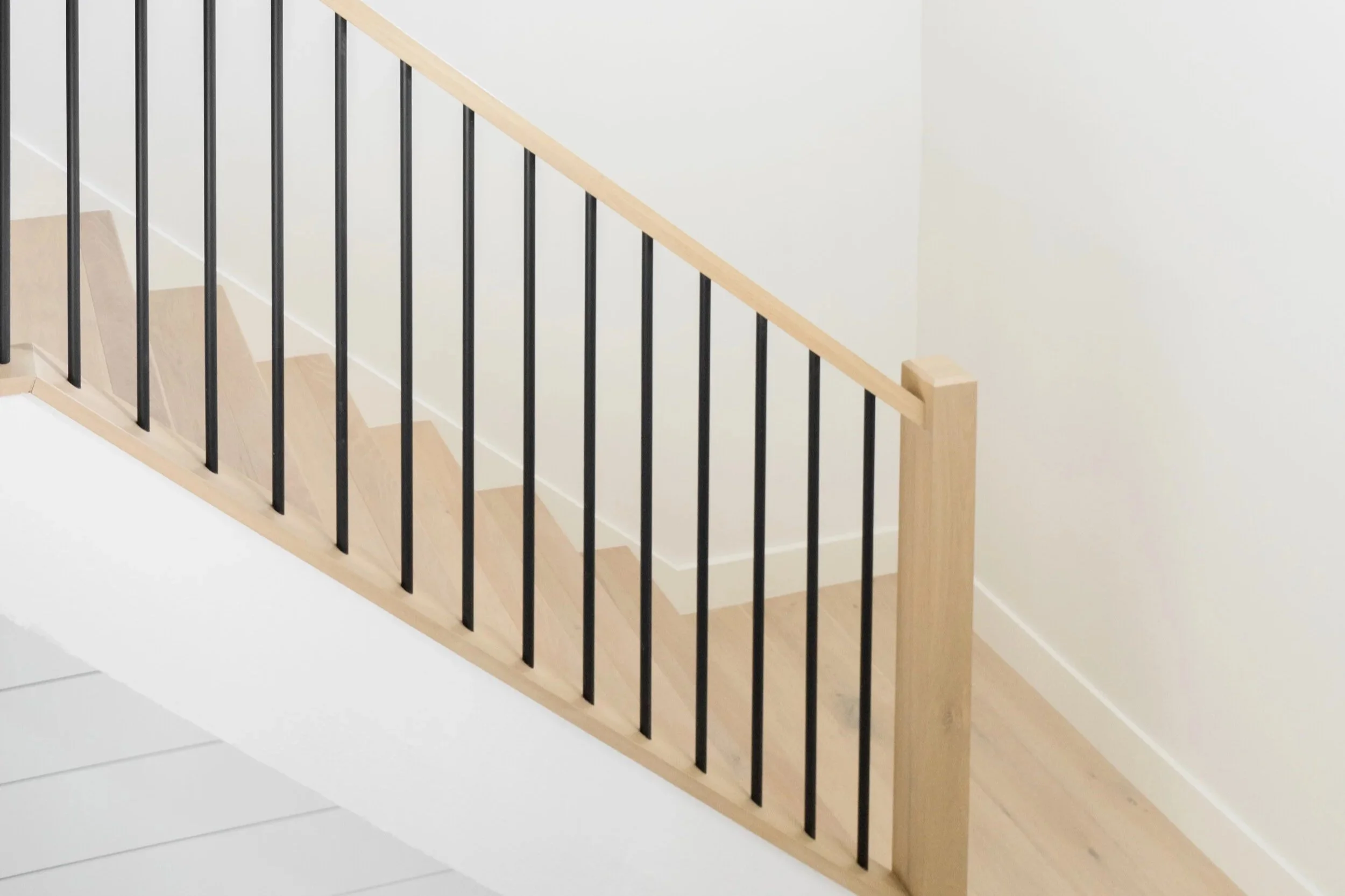
Light-colored flooring creates an airy, timeless foundation that complements the modern farmhouse aesthetic. Whether you choose engineered hardwood or a high-quality wood-look flooring, lighter oak tones help brighten a space while allowing other design elements to shine.
If your space allows, consider wider planks. They create a more seamless, custom look and can make larger rooms feel even more open and expansive.
A neutral color palette will never go out of style. By layering warm whites with soft taupes, grey’s, and natural textures, you can create a home that feels both elegant and inviting without feeling overly trendy. Statement pieces like black, or dark browns help to elevate the space and really bring the room to life.

Baseboards are often an overlooked design detail, but they can make a significant impact on the overall feel of a home. Taller baseboards with a simple mitered-edge profile create a clean, finished look that complements modern farmhouse design without feeling too formal.
Custom subway tile offers an elegant look with added personality. The slight variations from tile to tile create movement and texture, giving your backsplash a custom feel while adding subtle visual interest.
Design elements to reconsider when trying to achieve the Modern Farmhouse look
Rich, Saturated Colors: Deep, highly saturated colors can push a space toward a more traditional farmhouse aesthetic. Instead, opt for muted or earthy versions of your favorite colors to introduce warmth while maintaining a modern, timeless feel.
Narrow Shiplap Planks: When incorporating shiplap, proportion matters. Wider planks tend to feel more current and complement modern farmhouse interiors, while very narrow planks can make the space feel dated. Be sure the width is proportional to your trim, ceiling height, and overall scale of the room.
Short Baseboards: Trim details have a significant impact on the overall design of a home. We recommend choosing baseboards that are at least 3¾ inches tall to create a more custom, finished appearance.
Overly Rustic Lighting: Lighting should feel sophisticated rather than themed. Instead of heavily distressed or rustic fixtures, choose lighting with clean lines and simple silhouettes that complement the rest of your home's design. Creating a cohesive lighting plan throughout the home will help each space feel intentional and connected.
Warm Red-Toned Wood Flooring: Flooring with strong red or orange undertones can make a home feel dated and pull away from the clean, modern farmhouse aesthetic. Instead, look for neutral or lightly warm wood tones that blend seamlessly with the rest of your finishes.
Dated Prints & Patterns: Modern farmhouse design embraces simplicity. Instead of overly busy or dated patterns, choose classic textiles and lasting prints that add texture and interest without overwhelming the space. Layering natural materials and subtle patterns creates a look that feels fresh, inviting, and enduring.
Choosing the Right Flooring
Choosing your flooring is one of the biggest decisions you'll make during a renovation, and with so many materials available, knowing where to start can feel overwhelming. The right flooring should complement your home's style, fit your lifestyle, and stand the test of time. To help narrow down your options, we have created a guide for you to help make this decision a bit easier! Start by considering a few key questions:
Where will the flooring be installed?
What is your budget?
What overall style or aesthetic are you hoping to achieve?
A favorite flooring options is Luxury Vinyl Plank (LVP) because it offers a great balance of durability, style, and value. Not only is it a more budget-friendly option than many hardwood products, but installation costs are lower as well! LVP is water resistant, making it an excellent choice for busy households, kitchens, bathrooms, and homes with children or pets.
When selecting LVP, we recommend paying close attention to the wear layer. While many products are available at different price points, a 20 mil wear layer offers greater durability than a 12 mil option. If it fits within your budget, it's well worth the investment. Because the 20 mil option is commercial-grade, it means that product is much more resistant to scratches and everyday wear, helping your floors look beautiful for years to come.
Again, is important to keep in mind that with increased quality comes increased prices so these Luxury Vinyl Planks may not be as cost efficient as the “over the counter” options. But you definitely get for what you pay for when it comes to these floors!

Another option is Tile. Tile is a great option for many home styles including modern, transitional, mediterranean and more! It is extremely durable, east to maintain, easy to clean, difficult to stain, and a beautiful accent to some spaces! Whether you prefer the clean look of large format porcelain or the warmth of wood-look tile, there are endless options to fit your home's aesthetic. We could go on and on about the durability and abundance of great tile options, but the main takeaway should be that it is great for an active household!
If you’re worried about the ground feeling cold or the space feeling less cozy, we recommend accessorizing with a cozy area rug to create literal and figurative warmth!
The only “negative” is that the cost of install is significantly more expensive than other flooring options, but if you’re looking for a long term investment you certainly can’t go wrong with a beautifully tiled floor
The last option we will talk about is either an Engineered or Solid wood floor. Engineered hardwood is an excellent option for homeowners looking to achieve the look of solid wood at a more cost effective price point. It also performs well in spaces where humidity levels may fluctuate. Solid hardwood, while a larger investment, has the benefit that it can be refinished multiple times throughout its lifespan, making it a true long-term investment.
To keep your wood floors looking their best, it's important to clean up spills promptly and avoid prolonged moisture exposure, especially in kitchens and entryways. Another benefit of real wood is that it more easily hides knicks, dings and scratches compared to other options,
The style of wood you choose can also influence the overall aesthetic of your home. For a modern or transitional look, opt for cleaner grain patterns with minimal knots and subtle color variation. If you're drawn to a more traditional or rustic feel, woods with richer character and natural variation create warmth and timeless appeal.

Still unsure which flooring material is right for your home?
Our team is here to help. Contact MP James Design, and we'll help you select a flooring solution that complements your lifestyle, budget, and design vision!
Choosing the Perfect Backsplash
The perfect backsplash is more than just a finishing touch; it's an opportunity to elevate your entire kitchen. The right selection creates balance, adds personality, and brings together your cabinetry, countertops, and finishes for a truly cohesive design. Here are a few things we think are important to consider before making your choice!
Consider your space?
How large of a surface area do you have for your backsplash? The size and layout of your kitchen will help determine the best backsplash design. One of the biggest decisions is how high to take your tile. You can stop at the bottom of your upper cabinets for a timeless look, or extend it all the way to the ceiling for a dramatic, custom feel that instantly elevates the space. As a general rule, we recommend avoiding the standard 4–6" prefabricated backsplash often attached to countertops, save these for the bathrooms!
If your kitchen has only a small backsplash area, carrying the same material as your countertop onto the wall running to the height of the base of the cabinets creates a seamless look while making the space feel larger and brighter.
What is your budget?
A beautiful backsplash doesn't have to mean a bigger budget. One of our favorite approaches to saving money during renovations is using a timeless tile throughout the kitchen and incorporating a statement tile behind the range. This creates a stunning focal point while keeping material costs under your budget!
When combining multiple tiles, the key is balance. Your primary backsplash should provide a clean, timeless backdrop, allowing the accent tile to become the focal point without overwhelming the space.

A classic subway tile backsplash is elevated with a marble herringbone accent behind the range, adding a custom touch and creating a beautiful focal point.
What style are you going for?
For a clean, minimalist look, choose a classic geometric tile or continue your countertop material up the wall for a seamless finish.
If you're looking to make a statement, consider a full-height installation, a unique pattern, or a pop of color to create a stunning focal point!

Are There Any Design Constraints?
Before selecting your backsplash, consider any architectural details or layout limitations that may affect the installation. Small sections of wall, windows, outlets, or cabinetry can interrupt certain tile patterns; especially intricate layouts like herringbone. Planning the tile layout in advance helps ensure clean cuts and a seamless finish. It's also important to consider your existing cabinetry, countertops, and hardware. A well-designed backsplash should complement these finishes, creating a cohesive look that enhances the overall design rather than competing with it.

Considering the grout color.
Grout is the finishing detail that can completely change the look of your backsplash. The color you choose can either highlight your tile pattern or create a more seamless, understated look.
For classic subway tile, a contrasting grout emphasizes each tile and adds definition, while a grout color that closely matches the tile creates a softer, more cohesive appearance. With mosaic or patterned tile, grout selection should be made on a case-by-case basis to ensure it enhances the design while still complementing the tile selection, cabinetry and countertops.

Return on Investment
Maximizing the Return on Your Home Investment
One of the questions we're asked most often is, "Where should I invest my money to get the greatest return?" Whether you're preparing to sell, renovating your forever home, or purchasing an investment property, making strategic design decisions can have a significant impact on both your home's value and your everyday enjoyment of the space.
Return on investment (ROI) measures the gain or loss generated from an investment relative to the amount of money invested. When it comes to your home, ROI is about making thoughtful improvements that not only enhance your daily living experience but also increase your property's long-term value.
While every project is unique, certain renovations consistently provide a stronger return on investment than others. The key is prioritizing updates that improve both functionality and timeless appeal. Below are some of the home improvements we recommend to help maximize the value of your investment.

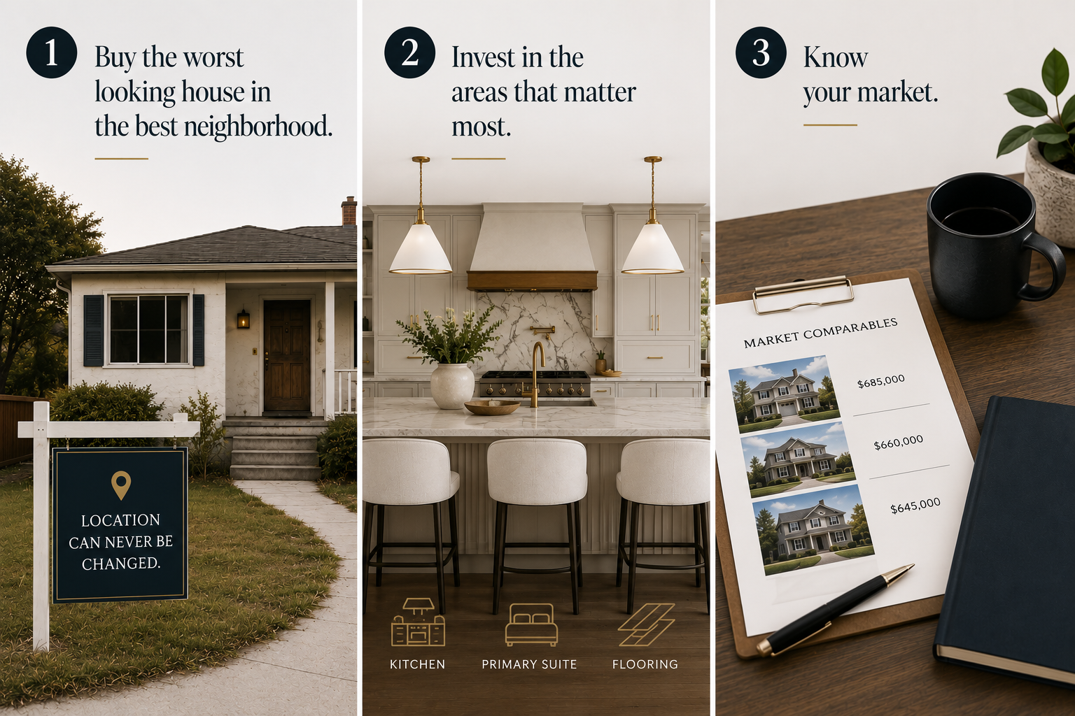
1: Buy the Least Updated Home in the Best Neighborhood
When purchasing a home, one of the best investments you can make is choosing the least updated property in the best neighborhood your budget allows. While finishes, landscaping, and interiors can all be transformed over time, location is the one thing that can never be changed!
It's easy to be drawn to a beautiful, move-in-ready home, especially with the influence of social media and today's design trends. However, those homes often come with a premium price. Purchasing a home with great potential gives you the opportunity to build equity while creating a space that reflects your personal style over time.
The goal is to think beyond today's finishes and focus on the long-term value of the property. A home's appearance can always be improved, but its location is permanent and that 8is extremely important to keep in mind while searching for your next home!
2: Invest in the Areas That Matter Most
Not every renovation provides the same return on investment. If your goal is to maximize your home's value, prioritize the spaces that buyers notice first: the kitchen, the primary suite, and the flooring throughout the home.
These are often the most expensive and disruptive renovations which nobody wants to live through during the time of renovation, which is why buyers place so much value on homes where they've already been completed. While cosmetic updates like paint, lighting, and hardware are relatively simple to change, replacing flooring or remodeling a kitchen requires a much larger investment of both time and money that many buyers don’t want to deal with.
When planning your renovation budget, focusing on these key areas will typically provide the greatest return while making your home more appealing to future buyers.
3: Know Your Market
One of the most common mistakes homeowners make is investing more in a renovation than their neighborhood can support. Before beginning any major project, it's important to research comparable home sales (comps) in your area.
For example, investing $50,000 into a luxury kitchen may not provide the return you're hoping for if nearby homes don't support that level of finish. While high-end appliances, custom cabinetry, and premium materials are beautiful additions, they should be appropriate for the value of the surrounding homes or else you will not get your money back in the long run.
A successful renovation strikes a balance between creating a home you love and making smart financial decisions. Understanding your local market helps ensure your investment adds value rather than pricing your home beyond what buyers are willing to pay.
Final Thoughts
Whether you're purchasing your first investment property or renovating your forever home, keeping these three principles in mind can help you make more confident decisions:
Buy the least updated home in the best neighborhood.
Invest in the spaces that add the most value.
Always understand your local market before renovating.
A thoughtful renovation should do more than improve the look of your home—it should be an investment in its future value. By planning strategically and making informed design decisions, you'll create a home that's both beautiful and financially rewarding.
The Pinterest Problem
How to Discover Your Design Style Without Feeling Overwhelmed
Pinterest has completely changed the way we gather design inspiration, but it can also make it difficult to know where to begin. With so many beautiful spaces to choose from, it's easy to lose sight of what you actually love.
The goal isn't to copy a photo—it's to use Pinterest as a starting point for discovering your own style. Whether you're remodeling your entire home, renovating a kitchen, or refreshing a single room, a thoughtful approach to inspiration will always lead to a more personal and cohesive design.
If you're like most homeowners, you've probably created a Pinterest board full of beautiful spaces with the intention of one day using them to renovate your own home. The problem? By the time you're ready to start your project, your "Home Inspiration" board is filled with everything from modern kitchens and cozy farmhouse living rooms to contemporary bathrooms and Mediterranean exteriors.
Suddenly, you're expected to make design decisions, but instead of feeling inspired, you feel overwhelmed. It's a situation we see all the time. You love classic white shaker cabinets, but you've also saved sleek slab-front cabinetry. One day you're drawn to warm oak flooring, and the next you're convinced marble and high-gloss finishes are the way to go. Before you know it, your contractor is asking for selections, your family wants answers, and you're making decisions simply to keep the project moving.
The good news? It doesn't have to be that way. Here’s some tips on how to use Pinterest to help you and not overwhelm you!
Tip Number 1: Discovering your design style
One of the biggest reasons Pinterest becomes overwhelming is because many people haven't identified their personal design style yet. When we first meet with clients, one of the first questions we ask is, "What style are you hoping to achieve?" More often than not, the answer is something like, "I don't know...I just want it to look nice." And that's completely okay.
Instead of focusing on style names, start by thinking about spaces you've genuinely loved. Maybe it was a boutique hotel, your favorite restaurant, a vacation rental, or a friend's home. Ask yourself what specifically caught your attention.
Was it:
The white oak flooring?
The warm paint color?
The lighting?
The cabinetry?
The natural textures?
Once you begin identifying the individual elements you're drawn to, you'll start noticing patterns. Those patterns are what define your personal style, not the label attached to it. The same goes for Pinterest. Rather than asking yourself, "Do I like this room?" ask, "What made me save this photo?" Was it the backsplash? The color palette? The windows? The hardware? You'll quickly discover that there are recurring themes throughout your boards that point you toward a cohesive design.
Tip 2: Organization of your Pinterest boards
One of the biggest mistakes we see is saving every design idea to a single board. Instead, create separate boards for each space in your home:
Kitchen
Primary Bathroom
Living Room
Bedroom
Laundry Room
Outdoor Living
Not only will this make planning your renovation much easier, but it also becomes an incredibly helpful shopping tool. The next time you're shopping for décor or furniture, you can quickly reference the room you're designing instead of scrolling through hundreds of unrelated photos. Staying organized helps you make more confident decisions, avoid impulse purchases, and keep your design cohesive from room to room.
Tip 3: Editing the Boards
Every few months, go back through your saved inspiration and remove anything that no longer feels like you. Maybe six months ago you loved bright white kitchens with marble countertops, but now you're drawn to warm wood cabinetry and natural stone.
That's completely normal.
By regularly editing your boards, you'll eliminate outdated inspiration and create a clearer vision of what you truly love. When it's finally time to renovate, you'll spend less time second-guessing your choices and more time bringing your vision to life.